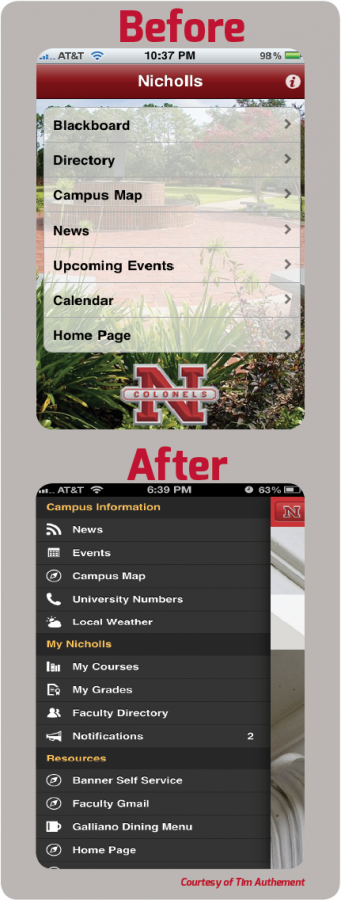
The newly designed Nicholls smartphone application offers students and faculty an easier way to navigate the campus’s virtual world.
The third version of the Nicholls phone app, which was released on Aug. 19, now offers several new features that allow the Nicholls community to take full advantage of the many websites students and faculty need on a daily basis in the palms of their hands. The “My Nicholls” tab of the app includes a course information, access of grades and university numbers, faculty information and a campus map. Other features include the “Social” tab, which includes all of the major social media pages associated with the University.
Christopher Usey, senior systems programmer and spring 2006 computer information systems graduate, was the sole developer of the 3.0 version of the app.
Usey said that the University was practically forced into redesign because certain functions within the 2.0 app were beginning to fail.
The first app was released on June 3, 2010, and was developed by Tim Authement, computer services computer specialist and spring 2010 computer science graduate, when he was still a student here. Authement suggested the idea of iPhone development to his instructor, Dr. Kent White, while taking CMPS 410, a special topics course.
Authement expressed his approval of the new app by saying the changes that were made are great: “Chris Usey has been able to add deeper integration of online services like Banner and Moodle which I didn’t have access to as a student. The design has also changed a lot and reflects some of the current design trends in mobile app development.”
Beginning with the design of 2.0, Usey wanted to make sure the design for Nicholls app was not a “cookie-cutter” or template design that most university applications tend to have since they are provided by companies such as Blackboard. “I really did not care for the look or the feel which is why we went with our own design and our own way of making 2.0,” Usey said.
Usey favors the courses feature of the new design because students now have their entire course schedule available to them at all times which is something Usey appreciates understanding how hard it is to find classes during the first days of school as a freshman at Nicholls. “I really wish we would have had something like this when I was a student because I was carrying around papers and had to print out my schedule,” Usey said.
Usey added that having a map that can guide you to your classes at your convenience also helps incoming students learn their way around campus and brings the app all together.
“The overall reaction of the newly designed app has been great across the board,” Usey said. The only suggestions that have been brought to him so far regarding improvements include adding a dining menu, which Usey said is in the works. Also, a rotation feature is also being worked on and should be added to the app in the coming weeks.
As for errors, students do not have anything to worry about. Faculty, however, may have trouble accessing the courses feature at times. Usey said the app may fail on faculty members who try to access this feature. Usey said he is working to fix this problem as soon as possible.
The Office of Information Technology uses Google Analytics to calculate exactly how many people are using the app actively and what features they are accessing. As of Aug. 22, the app had about 15,000 sessions total. Also, in between classes 105 students were actively using the app. The majority of those students, 47 total, were viewing their schedules.
Usey said about 90 percent of app users are using the iOS devices while the rest are Android devices. With the development of the 3.0 app, both iOS devices and Android devices operate on two different platforms. This means that the app functions properly for both operating systems without trying to adapt to both on one platform. On the 2.0 app, Usey said that the iOS devices functioned more properly than Android devices. However, with the development of two separate platforms, Android devices now functions just as well as iOS devices.
Usey plans to update the app either monthly or at least once per semester. One feature he hopes to develop is for students to begin the registration process from the app. This feature is looking to be added by the end of the year or next year.
To send suggestions regarding the app to the Office of Information Technology, look under the Resources tab of the app to find the “App Feedback” feature and fill out the form.
Nicholls smartphone application receives a makeover
Tiffany Williams
•
August 29, 2013
0
More to Discover


