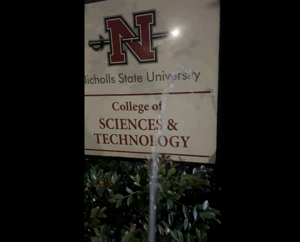
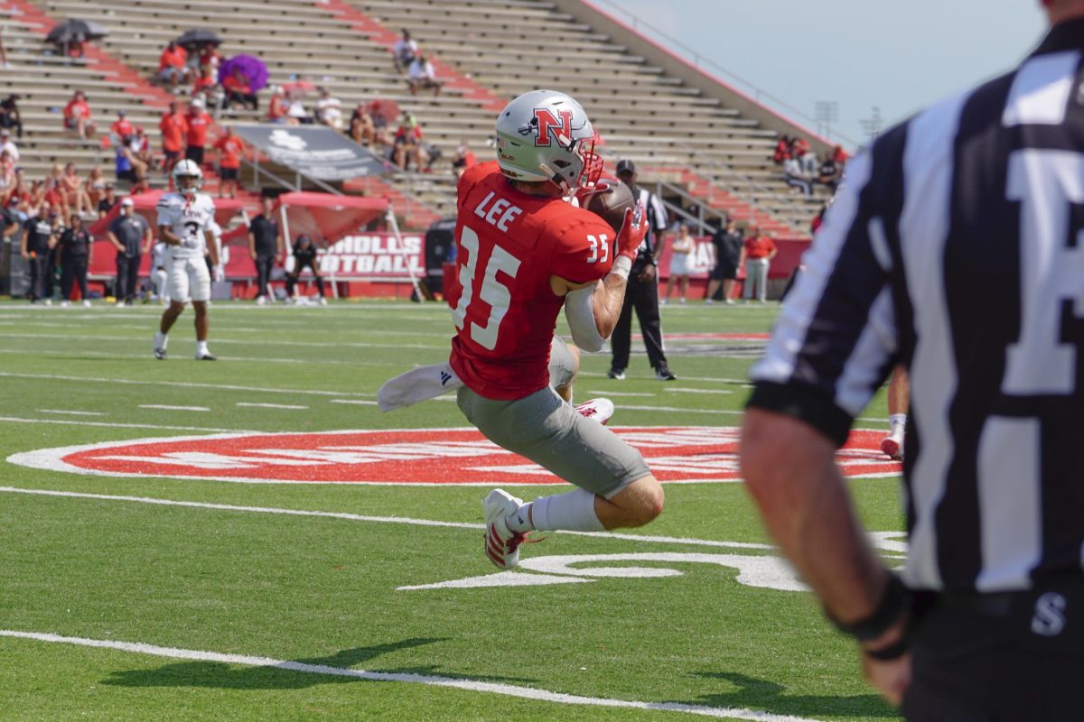
As many of you know, the new Nicholls logo was unveiled last week.Many bewildered reactions followed. What did the logo represent? Someone building a camp fire? A windsurfer? The infant Superman’s space pod escaping an exploding Krypton?
It is simple really. Anyone who read the articles and press releases is aware that the logo contains an assortment of profound imagery that is inspiring enough to make any self-respecting Nicholls student teary-eyed.
The logo consists of five elements: a wave representing the source of all life, a reed stalk representing agriculture, a globe representing the world-wide reach of Nicholls, an ellipse signifying the nuturing spirit of our beloved institution, and an eternal flame symbolizing the light of knowledge.
The reed stalk is indistinguishable from the flame. All of these lofty metaphors are lost on the average viewer.
A good logo, no matter how abstract, should be easily decipherable and have instant recognition. Microsoft¡s icon of the floating windows is a good example. Another is Nike¡s check.
Besides the content, my main complaint about the logo is not about the design. Although it is not a particularly good design, I do think that there is something aesthetically pleasing and even dynamic about the design if looked at from a certain perspective. I believe that the reason the logo is so off-putting is not due to the design but the context of it.
First of all, the style is outdated. University Relations would have us believe that the logo is modern, on the cutting-edge of contemporary design and thus reflecting the progressiveness of the University. There is no doubt that the logo is modern, as in Olympics circa-1984 modern.
If this was the intention (which it was not), it is not a bad thing in itself. Using styles from other time-periods in a design can work. However, in order for it to work the style has to be adapted in a contemporary way. Think of the advertising campaigns of stores like Old Navy and Target. They use a sixties style, yet one would never mistake a Target ad for one straight out of 1966.
In contrast, I think you could stick the Nicholls logo smack dab in the mid-80’s and it would fit right in with new wave hair-dos, Boy George and Reaganomics.
Then there is the point that it does look like the Olympics or some other sports symbol. Several people who I showed the logo to had this reaction before I even voiced my personal opinion. The typical response was “Okay, what team is it for?”
It goes without saying that a University logo should be in an University style. I am not suggesting anything conservative by any means, but there should be some formalism at work here.
The designer of the logo is only partly to blame. I am not aware if this is typical of his work, but it is true that even the best designers sometimes use bad judgement. While he is responsible for the actual design he is not liable for the implementation of it.
Unlike other artforms, the essential element in design is communication. Unlike painters or sculptors, the designer is not allowed a big dose of self indulgence. The audience plays a very important part in the process, and therefore should be directly involved.
Responsible for the lack of this is the administration that made the judgement call. It is ironic that University Relations proudly proclaim that the logo appeals to the students when they were not even involved in the selection process.
A fair process would have been to have a review board with several students, faculty members and at least two people with an adequate knowledge of art, design and the mass media.
Until that happens, Nicholls students will proudly wear their new logo while being accused of trying to start an 80s Olympic windsurfing revival.
Brandon Bailey is an Olympic windsurfer and Art major. His design and art work can be viewed on his website at www.bcbailey.net.


